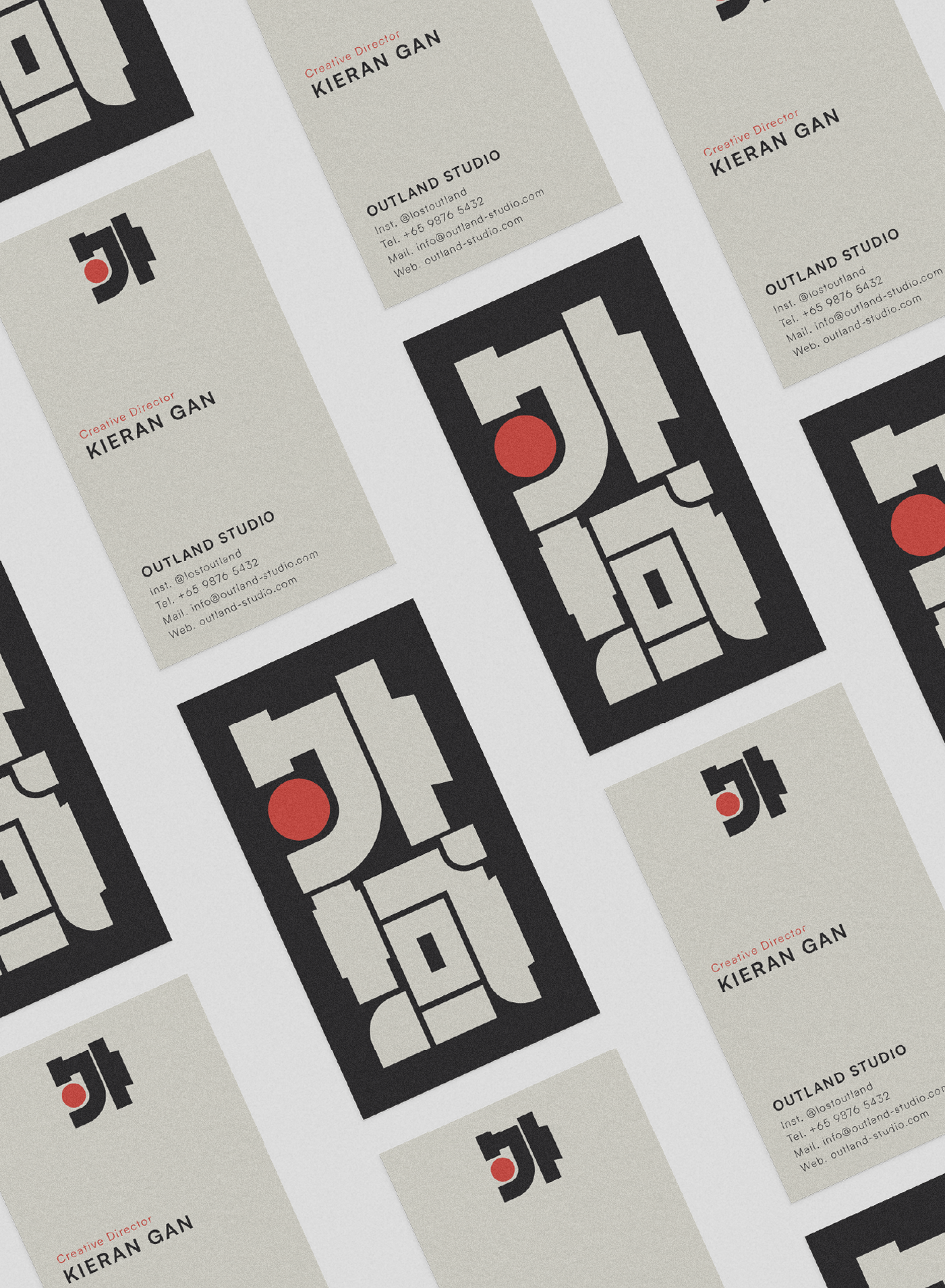
Creative Direction / Brand Identity
OUTLAND STUDIO
PROJECT BY:
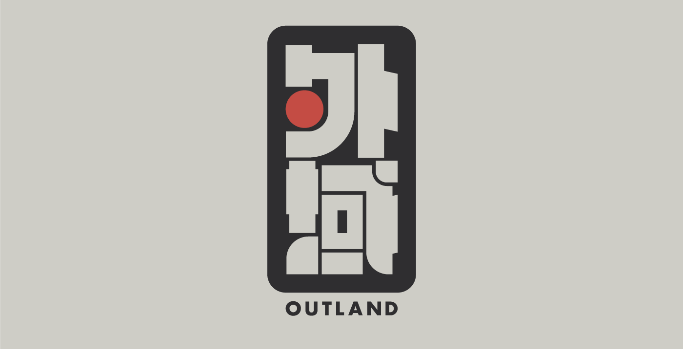
OUTLAND
Creative Direction / Brand Identity
PROJECT BY:
OUTLAND
Outland Studio partners with businesses ready to move beyond the generic. Crafting brand identities that are purposeful, memorable, and entirely their own. Outland works with founders, companies, and creatives who understand that a brand is more than a logo or a colour palette. It is a living, breathing point of view, one that enters the room before the people behind it do.
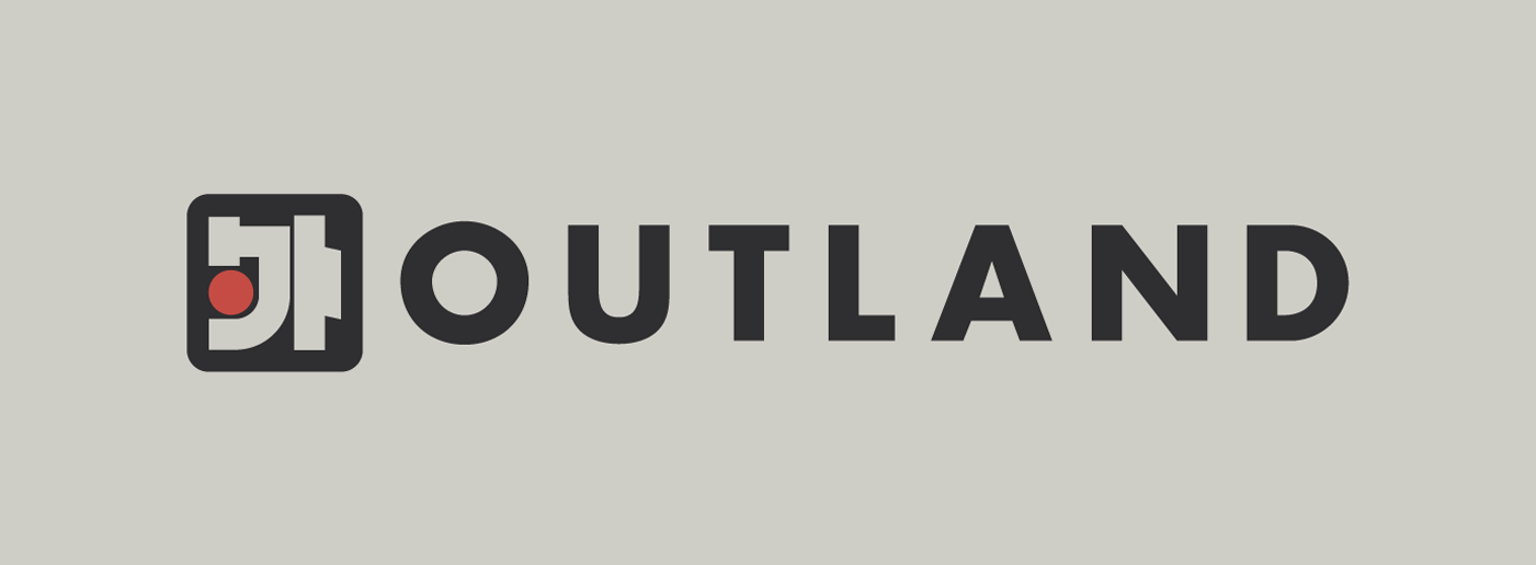
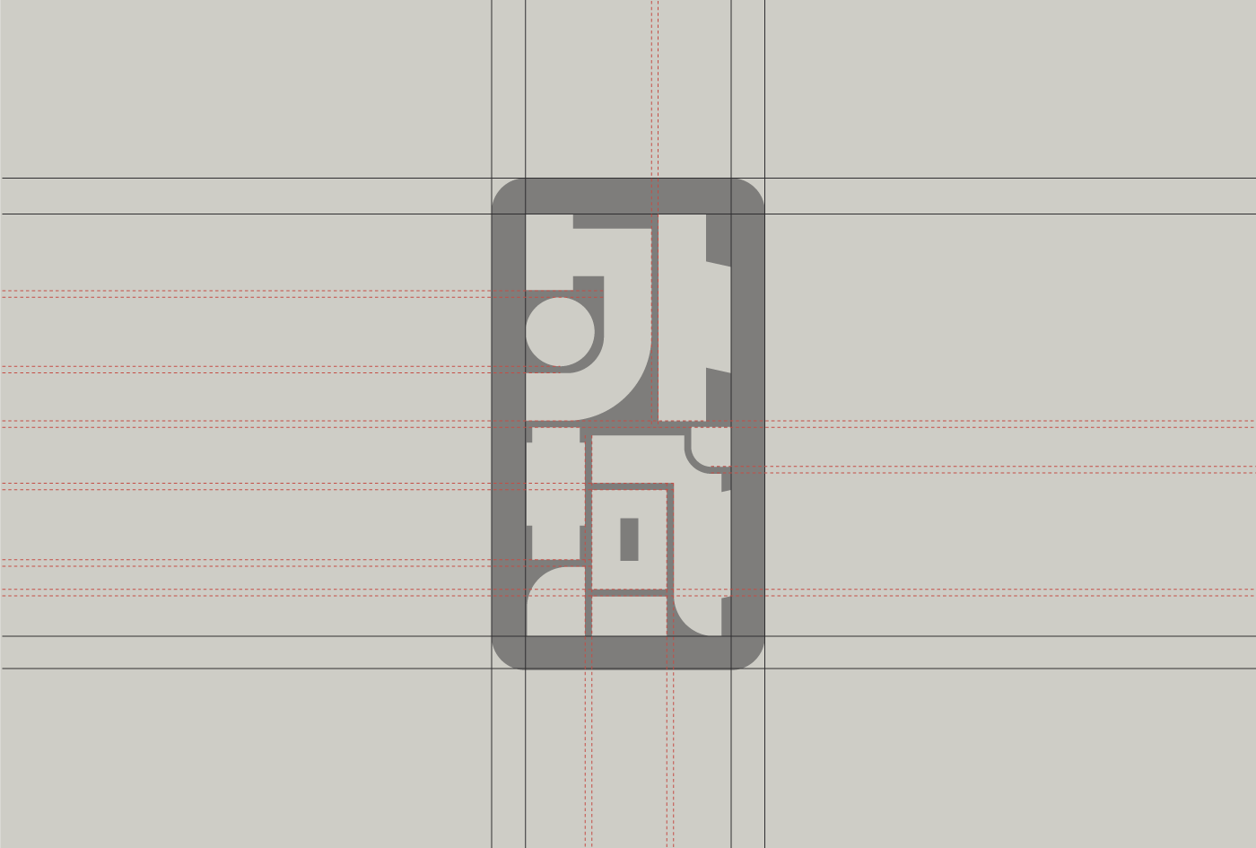
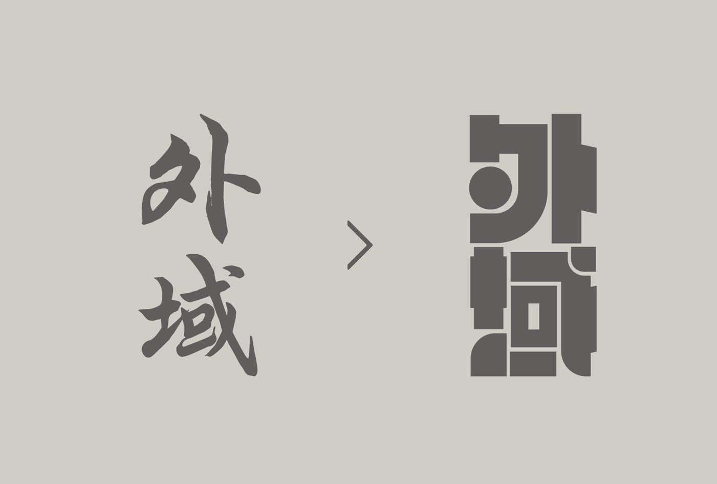
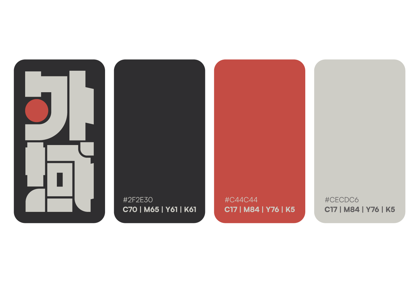
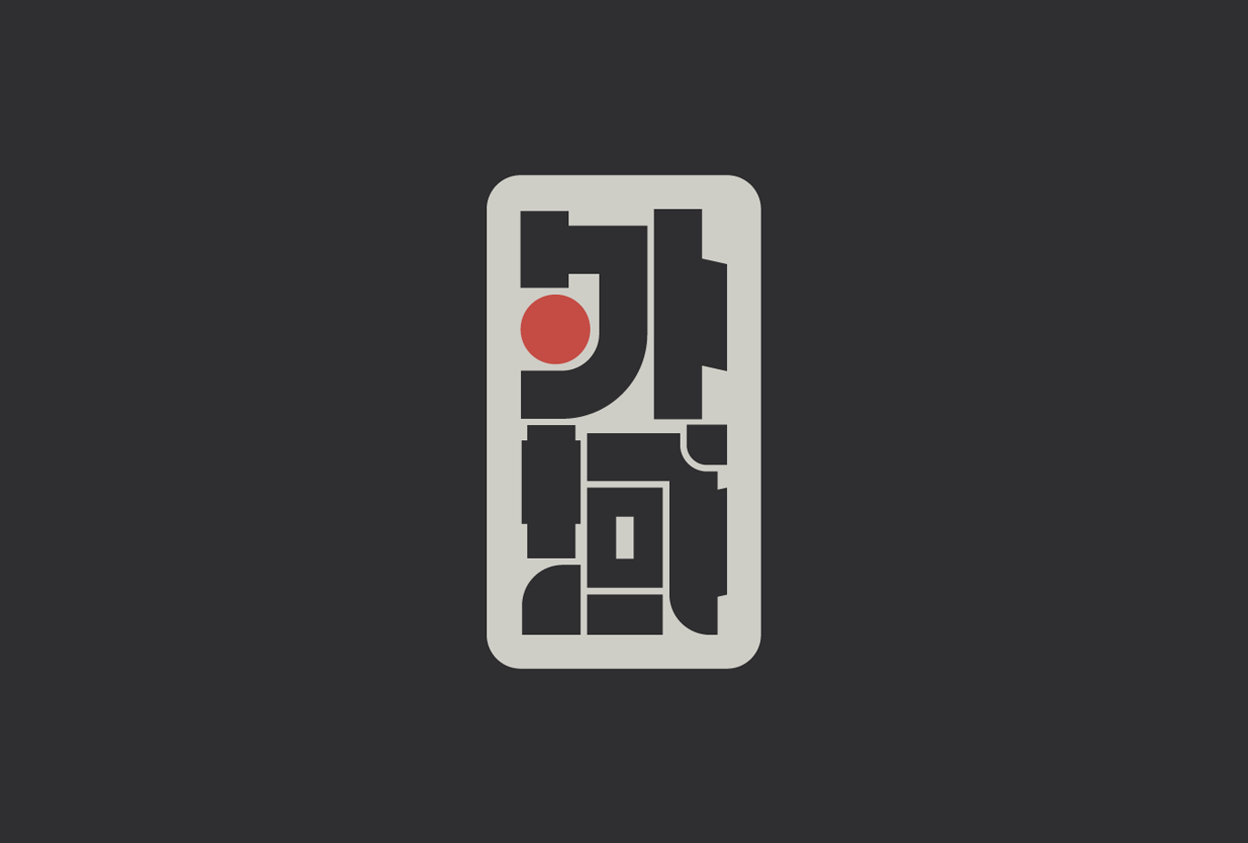
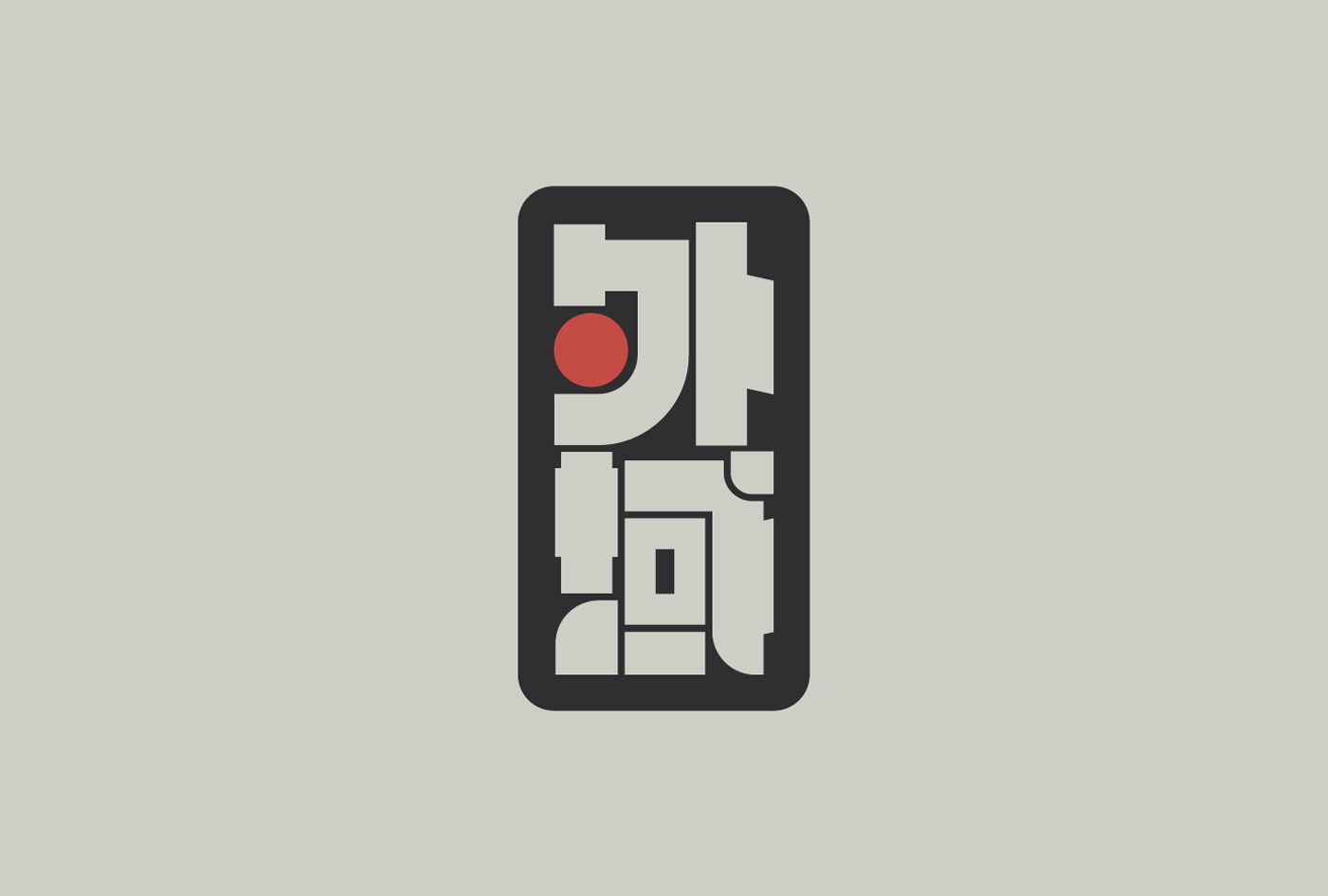
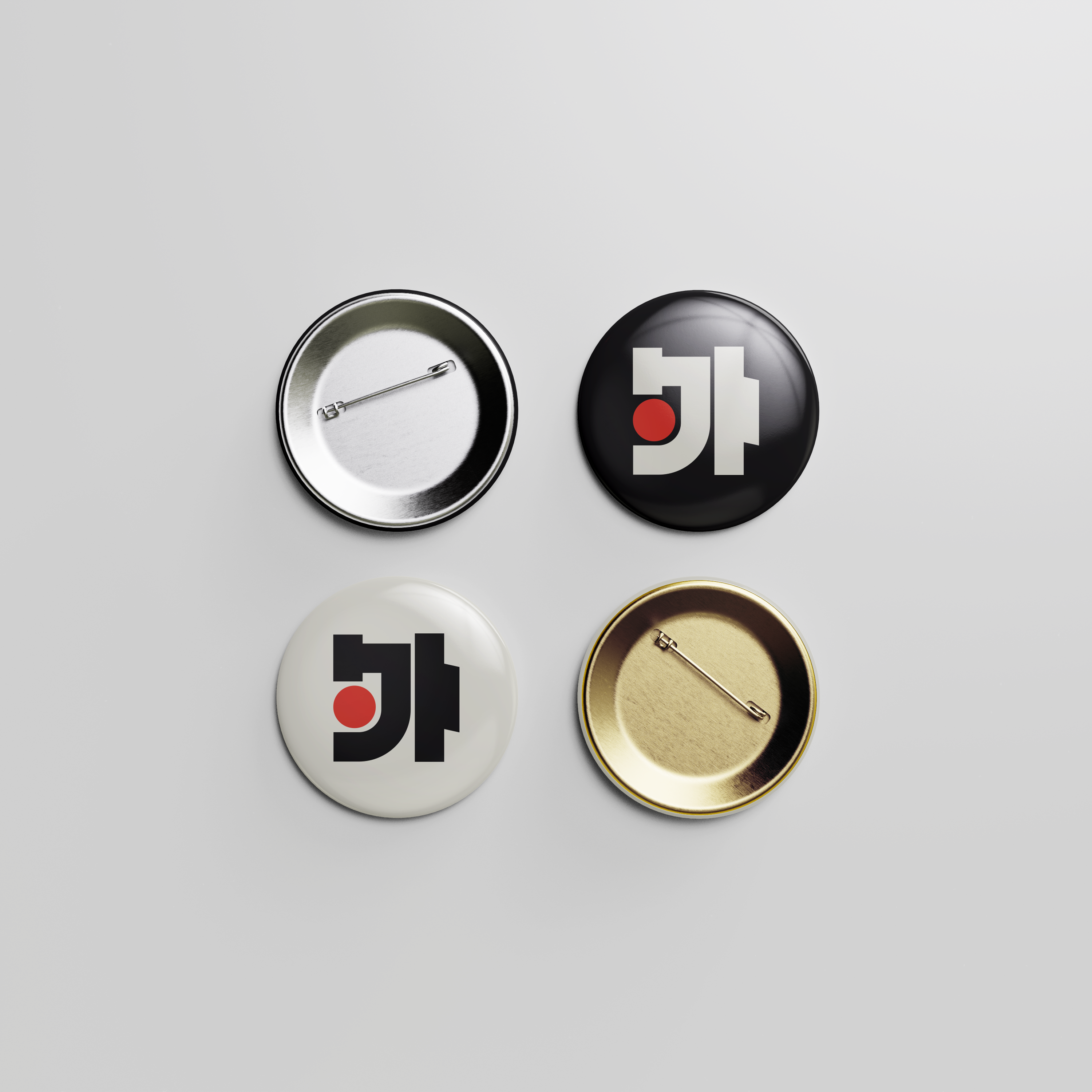
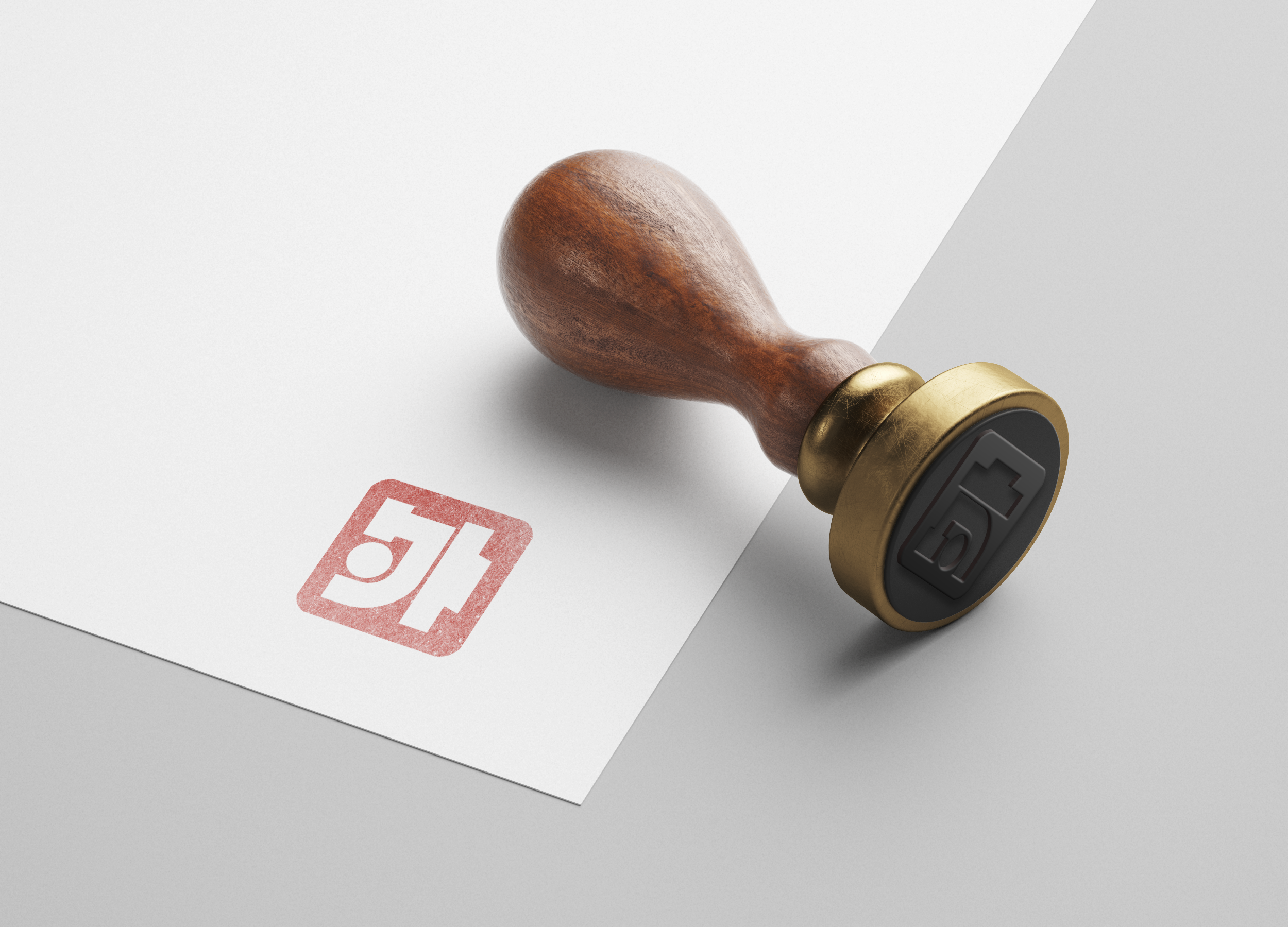
The Outland mark is built around two characters — "外域".
Together they translate to "outer realm,"
a direct and intentional reflection of the Outland name and its frontier identity.
The design sits at the intersection of modern and traditional,
drawing from the centuries-old practice of Chinese seal carving,
where characters were carved into stone and pressed as a mark of authority and identity.
That tradition is reinterpreted here through a contemporary lens,
each stroke abstracted into bold, modular geometry that feels architectural and precise, bridging the ancient and the now.
A single red dot punctuates the composition. In traditional Chinese seals,
red was the colour of the ink, the mark of authenticity.
Here it carries that same weight,
standing as the one deliberate accent in an otherwise restrained palette.